Suggestion Drop-Downs Being Confused with Other Fields
I always learn things about usability when watching my Dad use a computer. Recently I observed the following:
So as you type a station name into https://www.thetrainline.com/ it makes suggestions. So there are two fields, the “From” and the “To”. If you enter text in any of them, a drop-down appears with suggestions. Both these points are obviously completely standard UI practices, what could go wrong?
It turns out if you enter text in the “From” field, and type text which is sufficiently specific to trigger only a single suggestion, visually, that single suggestion in the “From” field lines up visually with the “To” field.
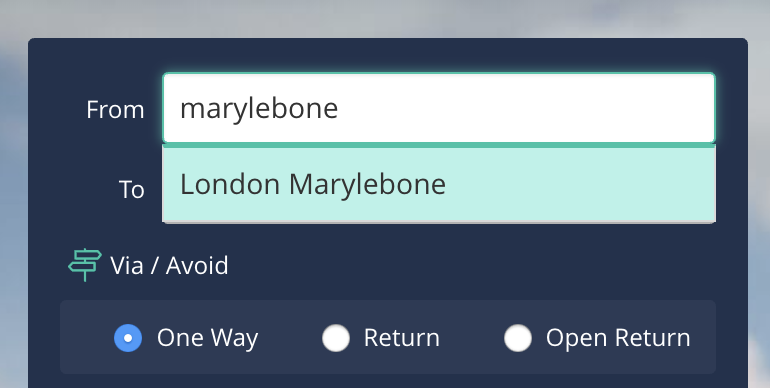
My Dad exclaimed that we wanted to go from Marylebone and not to Marylebone. He was confused because he’d believed he’d typed the text into the “From” field. And given that he typed into the “From” field already he didn’t know how to go about being even more persuasive that he really meant the “From” field.
I can think of a number of ways to solve this:
-
Put “From” and “To” each on their own screen of a “wizard” style interaction (with a “back” button at every stage so you can navigate between the fields)
-
Put the fields next to each other horizontally: Put the “From” on the left, and the “To” on the right. When the drop-down appears, it’ll be underneath the field, and clear to which field it belongs.
-
What other solutions have I missed?
I suspect the real problem is that nobody thought this could be a problem. They envisaged the drop-down visually having lots of entries. And the solution to that is usability testing!